Introduction
Welcome to my personal website! This post will give you a broad overview of how the website was created, the libraries used, and some design decisions that went into it.
Purpose of the Website
My website is a place for me to showcase my portfolio, blog about my projects, and share my interests with others. I wanted to create a platform that reflected my personality and style, while also providing a great user experience.
Building the Website
Design Process
As someone with no prior experience in design, creating my website was a challenging and rewarding learning experience. The design process began with initial prototyping in Figma, but the majority of the work was done while implementing the website itself.
Throughout the design process, I drew inspiration from a variety of websites. I was particularly drawn to sites with clean, modern designs that incorporated 3D elements and animations. I also looked at a lot of examples of creative typography and layouts.
As I implemented the website, I was constantly iterating and refining the design. For example, I would adjust the shadows on certain elements, tweak the spacing between different sections, or adjust the color palette to make the design more cohesive. These small tweaks and adjustments hopefully helped to elevate the overall design and create a more polished and professional-looking website.

Overall, the design process was iterative one. By drawing inspiration from other websites and constantly refining the design as I implemented it, I was able to create a website that accurately reflects my design aesthetic and provides a great user experience.
Styles
My website is styled using styled-components, paired with CSS variables. I aimed to make the styles easy to understand and modify, with each component being styled in only one of two ways
- Via global styles which are all grouped in one directory
- Via styled components By avoiding situations where the parent component is styling its children and vice versa, it was easier to understand how the styles are applied to each component.
Gradients/shadows
I used gradients for highlighting some text or background on article images. For example, the background gradient on the hero image and the gradients used on the project cards on the home page were created using Josh Comeau's Gradient Generator.
In addition, I used shadows consisting of multiple layers to create a visually pleasing look and feel throughout the website. For example, the shadows used on the hero image and the project cards were created using Josh Comeau's Shadow Palette.
By using multiple layers of shadows and gradients, I was able to create a more dynamic and visually engaging website.
Technology Stack
Several libraries powered the creation of my website, some of the major ones are listed below:
next.js
Next.js is the heart of my website. Thanks to server-side rendering, it provides a great user experience and performance.
react-three/drei
I used react-three/drei for the hero image on the home page, alongside @react-three/fiber. These libraries allowed me to create a visually stunning and interactive 3D scene.

react-spring
React-spring is an animation library that emulates spring physics, making animations feel natural and smooth. It was used throughout my website to add delightful animations to various elements.

slick-carousel
I used slick-carousel for the carousel on the home page, which allowed me to create a dynamic and visually engaging slideshow.

next-themes
Next-themes is a library used for handling theme changes. It made it easy to implement a dark mode and allowed users to switch between light and dark themes.

@codesandbox/sandpack-react
I used @codesandbox/sandpack-react for the interactive code editor, which allowed users to edit and preview code in real-time. This was particularly useful for my blog posts and project pages, where I wanted to showcase code snippets and examples.
Hero image
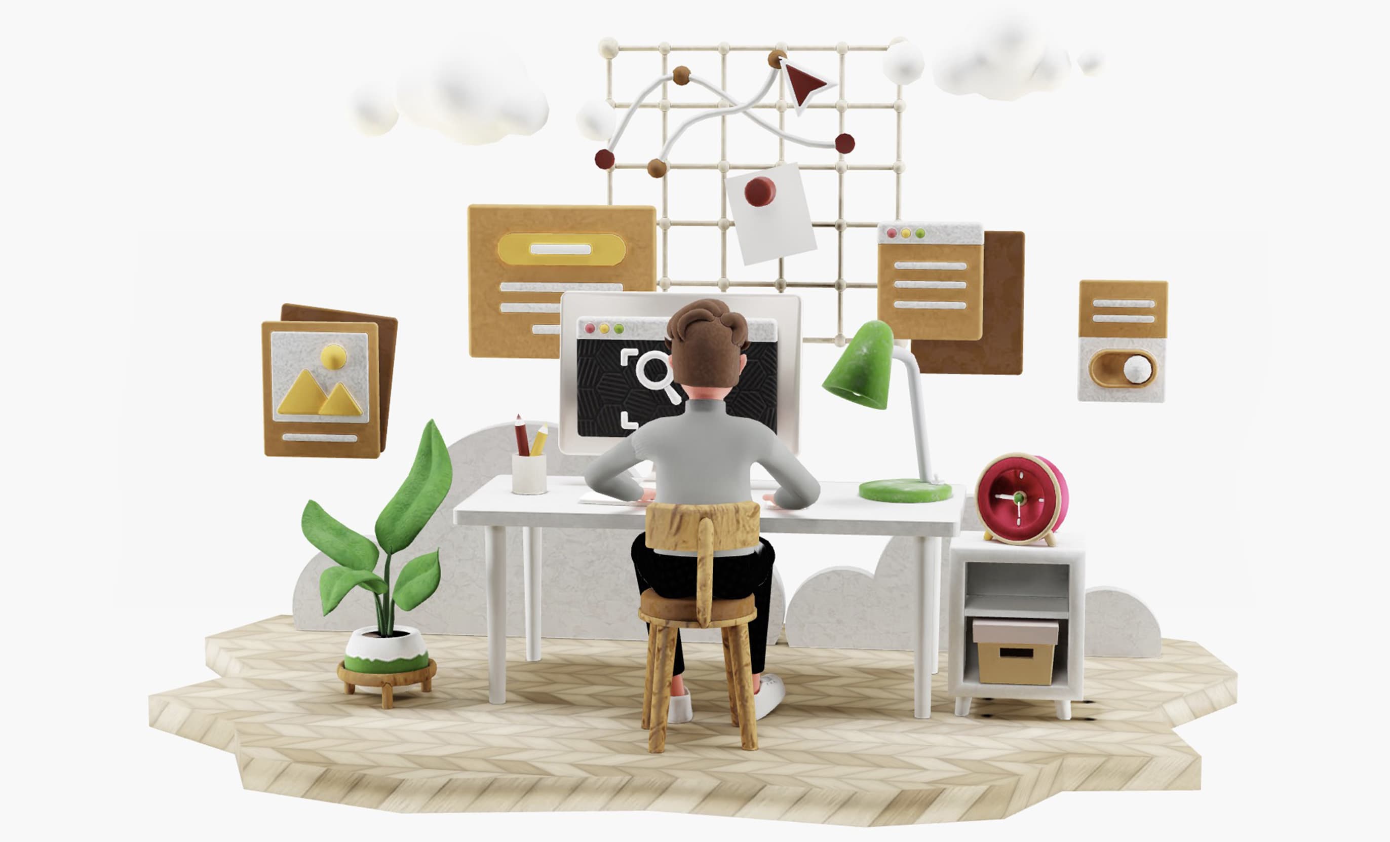
The hero image on the home page is a visually stunning and interactive 3D scene. To achieve this, I used react-three/drei and @react-three/fiber libraries. The models are a combination of 3D models from ui8.net which I then modified in Blender. Most of the models had a high-quality mesh, which required quite a lot of manual work to make them low poly. All the textures and materials are baked into the model, which makes the scene look good and performant.
To allow the theme of the scene to be changed dynamically, I baked two variations of the same texture, which I then swap based on the theme. The light and dark themes have slightly different textures and colors, giving the scene a unique look and feel for each theme.

Overall, the hero image was a challenging but rewarding aspect of my website. It adds a unique visual element to the home page, making it stand out and leaving a lasting impression on visitors.
Sub pages
The sub-pages on my website, such as project pages and blog posts, are rendered using MDX and mdx-bundler. This allows me to embed interactive elements like code editors in the markdown files. With the help of getStaticProps and getStaticPaths, I am able to dynamically generate links to all the projects and blog posts based on the project filesystem without the need to manually create them.
Summary
Building my personal website was a great learning experience. Through the challenges and successes, I learned a lot about website development and design. I hope this post gave you a good overview of my website and the technologies I used. Please reach out if you have any questions or want to learn more about my project.
